Rogue Scholar Posts

language
Published in Andrew Heiss's blog

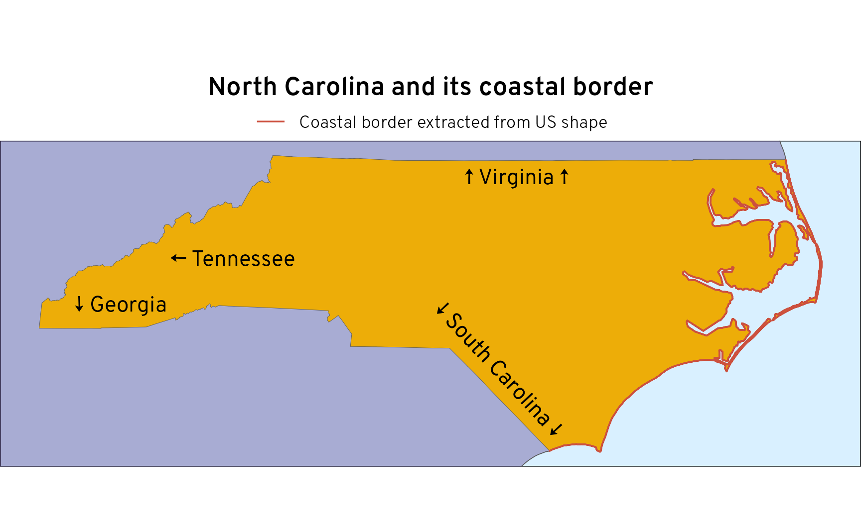
A few days ago, my wife, a bunch of my kids, and I were huddled around a big wall map of the United States, joking about the relative unimportance of Rhode Island, the smallest state in the US. It’s one of the states I never ever think about: …and it’s just so small . Amid the joking, my wife came to Rhode Island’s defense by declaring that even though it’s so small, it has one of the highest proportions of coastline to land borders.

Published in Andrew Heiss's blog

Even though I’ve been teaching R and statistical programming since 2017, and despite the fact that I do all sorts of heavily quantitative research, I’m really really bad at probability math . Like super bad. The last time I truly had to do set theory and probability math was in my first PhD-level stats class in 2012.

Published in JP's blog
Author JP Monteagudo

Visualization & Pearson’s correlation coefficient The 30DayChartChallenge is a data visualization community that hosts daily challenges for April. Today’s challenge involves dinosaurs. I used the Datasaurus package to create an animated visualization to demonstrate the importance of graphing data, and the effects of outliers on statistical properties.

Published in rOpenSci - open tools for open science
Authors Francisco Cardozo, Yanina Bellini Saibene, Camille Santistevan, Lou Woodley

The goal of the rOpenSci Champions Program is to enable more members of historically excluded groups to participate in, benefit from, and become leaders in the R, research software engineering, and open source and open science communities. This program includes 1-on-1 mentoring for the Champions as they complete a project and perform outreach activities in their local communities.

Published in JP's blog
Author JP Monteagudo

Lissajous Curves Lissajous curves are created by plotting two oscillations on perpendicular axes and ​​​. These oscillations, represented by sinusoidal functions, intersect to create different patterns. When the ratio of these frequencies is equal to — the oscillations are equally phased— the curve is a straight line.

Published in Andrew Heiss's blog

I’ve used Garrick Aden-Buie’s tidyexplain animations since he first made them in 2018. They’re incredibly useful for teaching—being able to see which rows left_join() includes when merging two datasets, or which cells end up where when pivoting longer or pivoting wider is so valuable.

Published in JP's blog
Author JP Monteagudo

RQ: What exactly is the CLT and what’s the deal with n 30? CLT - mathematical definition and simple terms definition How we use CLT How to know when empirical distribution converges to normal distribution? How did we come up with n $ $ 30? Cohen (1991) Taught that at least 30 observations were needed to use critical-ratio approach used in t-tables when comparing groups.

Published in recology
Author Scott Chamberlain

I’ve been working on an inherited Shiny app at work for the past few months. One of the many frustrating things about Shiny lately has been around buttons. Well, it wasn’t really about buttons, but that’s where it started. I noticed that a number of buttons - some having file inputs, some having text inputs - did not trigger every time, and I expected them to trigger every time no matter what.